The “Share” feature in YouTube will give you a URL, or will generate an “iframe” embed code, to play a YouTube video in your WP page. BUT, if you want:
- a video that fills the available page or column width, and
- is responsive down to smart-phone screens held in portrait mode,
…you need to do one more thing. Neither the standard YouTube embed code, nor the WordPress “Embed” blocks, will do both.
If you already know how to get the YouTube Embed Code (not the URL), do the following. If you don’t know how jump to the “Full Instructions.”
- Use a “Custom HTML” block (not an “Embed” block)
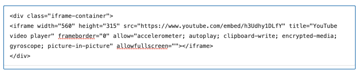
- Copy YouTube’s embed code that begins with <iframe … and ends with… allowfullscreen></iframe> – and paste into the “Custom HTML” block.
- KEY – you must, right now, insert =”” (equal sign-double quote-double quote) directly after the phrase allowfullscreen – to look like this at the end: allowfullscreen=””></iframe> (red is for emphasis only) See why “right now” is so important, below
- Now insert <div class=“iframe-container”> on a new line above the opening phrase <iframe>
- Lastl: insert </div> on a new line after the allowfullscreen=””></iframe>
Your Custom HTML block should now read something like this
… and your video should now expand to the full-width of the page or column and it should shrink on smaller screen sizes. See examples at the bottom of this page.
Full Instructions
By default, the “Embed” code (that begins and ends with <iframe … </iframe>) generated by YouTube’s “Share” feature will come with a width and height setting in pixels. It will usually be something like “width=”560″ height=”315”; It will be responsive for smaller screen sizes but will not make the video appear to fill a page or column wider than about 600px.Setting these dimensions higher in order to fill the page/column width just makes them hang out of the page frame on smaller browser windows.
Note: that the YouTube Embed code (<iframe … </iframe>) will only work with WP’s “Custom HTML” block. Confusingly (!!?) both the WP (actually, Jetpack) “Embed” block and the specific “YouTube” embed block do not provide controls on our site for fully managing the display. You can only paste a URL in those blocks and YouTube still controls the playback as above (i.e., smaller, but not larger, playback sizes).
Here’s what we do on the DC site to fix that, without having a plugin available to do it for us. Stick with me, the code fix is EASY. The explanation and the cautionary box are to help the first time you do this.
To make the following work we’ve added CSS code to “Appearance / Additional CSS” section in the dashboard (left sidebar). This will let us put the video in a separate “container” (a “div” class) that controls the display of the only-partially-responsive YouTube code.
Now, when you add the embed code for a YouTube do the following:
- Insert a “Custom HTML” block in your page (not an “Embed” block – The WP embed blocks are frames for URLs, not really for HTML embedding)
- Go to the video on the YouTube site:
- Select “Share”(just below the player window)
- Then click “Embed”
- Copy the HTML code you see in YouTube’s “Embed Video” window. It will begin with <iframe … and ends with… allowfullscreen></iframe> – and paste that into the “Custom HTML” block.
- KEY – you must, right now, insert =”” (equal sign-double quote-double quote) directly after the phrase allowfullscreen, to look like this at the end: allowfullscreen=””></iframe> (red is for emphasis only) See why “right now” is so important, below
- Insert on a line above the opening <iframe> the following <div class=“iframe-container”>
- Insert on a line after the allowfullscreen=””></iframe> the following </div>
Your Custom HTML block should now read something like this
… and your video should now expand to the full-width of the page or column and it should shrink on smaller screen sizes.
Why: YouTube closes the embed HTML code you copied from its site with a shorthand for allowfullscreen. A better form includes =””. Without the =””, as soon as you update the page WordPress will auto-correct the poor syntax (i.e., balance the tags) and add equal signs and double quotes in unexpected and incorrect places. Trying to fix this without inserting the =”” before the last <i/frame> tag means that every time you update it will get worse and worse!
See the examples below (in EDIT mode) if you want to see the iframe codes
Examples
Using “iframe-container” div tag – Recommended
(open the page in EDIT mode to see the actual code)
No “iframe-container” div tag – Not Responsive
(open the page in EDIT mode to see the actual code)
Using the WordPress “Embed” block – Responsive on smaller screens but will not get wider than the 560-pixels. In the Chrome browser, this will also append a large empty space below the player window!
(open the page in EDIT mode when using the Embed block and you won’t see code – though you will see a preview)
Embed code in Custom HTML block, but width set to 900 px and height set to 506 px. Will fill the page and column at screen size above 1200 px wide, but overruns page margin at smaller screen sizes
(open the page in EDIT mode to see the actual code)